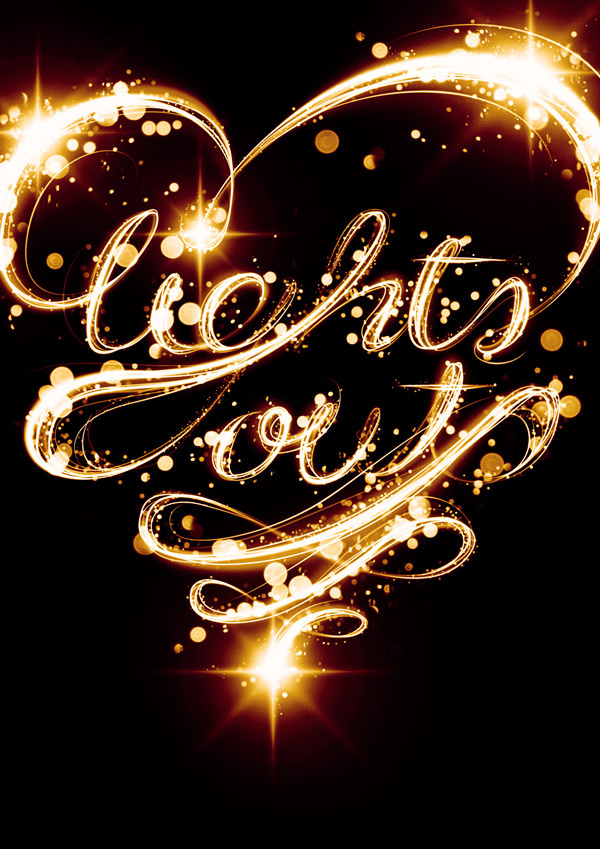
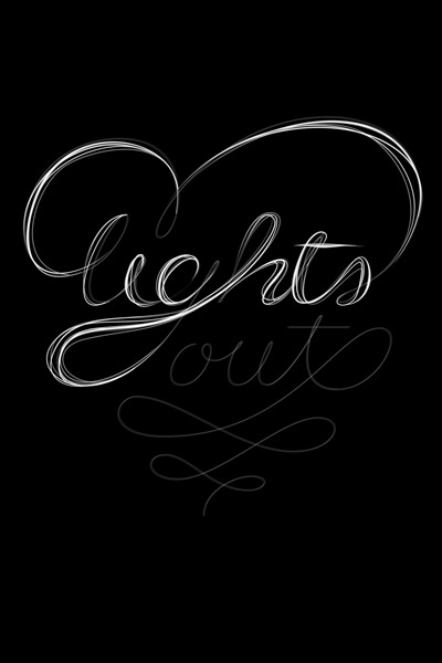
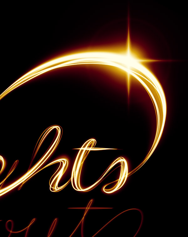
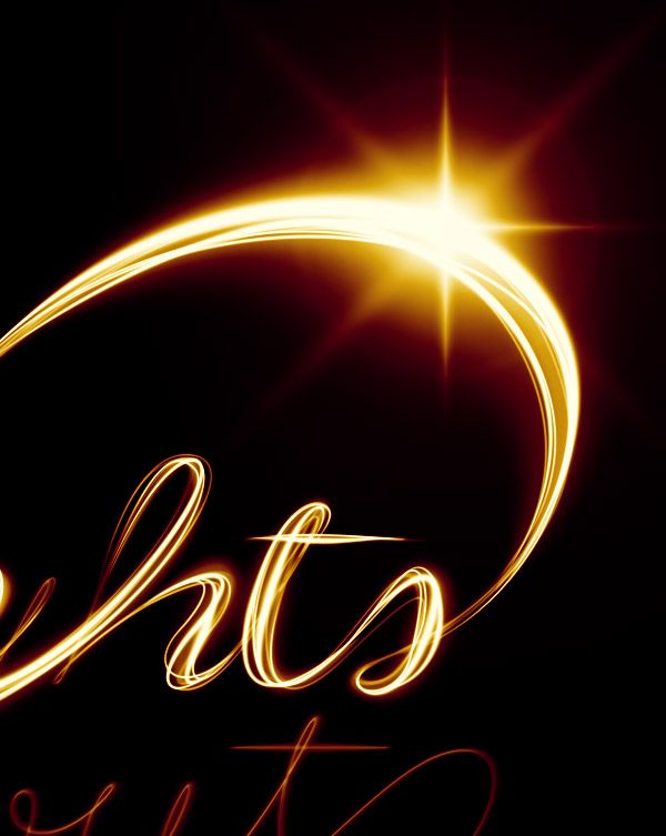
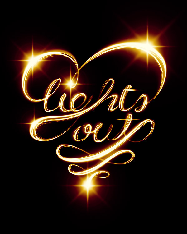
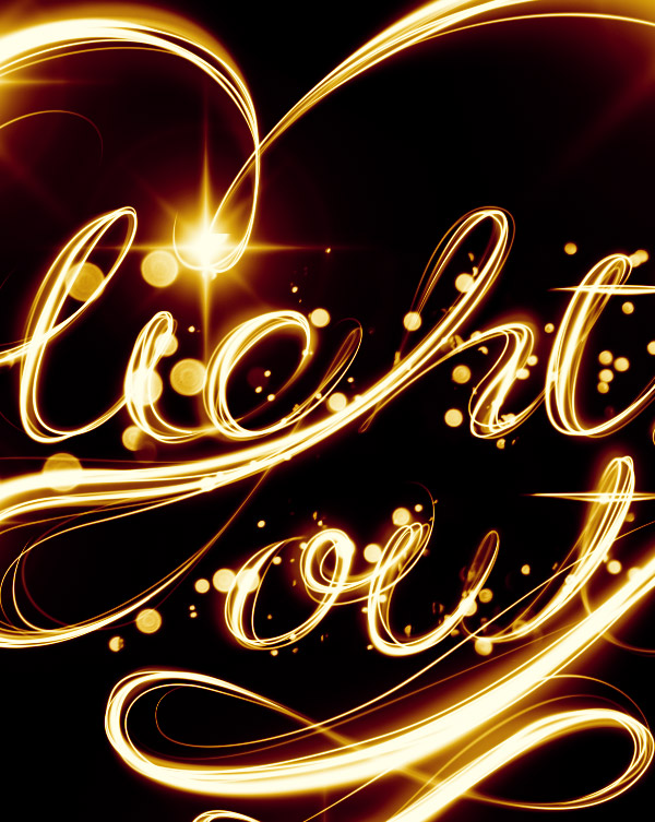
 What You'll Be Creating
 This tutorial was originally published in April 2011 as a Tuts+ Premium tutorial. It is now available free to view. Although this tutorial does not use the latest version of Adobe Photoshop, its techniques and process are still relevant.
If you've ever attempted to write words using traditional light painting photography techniques, you probably know how challenging it can be to create words that are easy to read. In this tutorial, we will demonstrate how you can create a similar look without a camera and tripod. Let's get started!
1. Sketch Out Your Composition
Step 1
Let's start in Photoshop. Launch the program and create a new document. When creating everything from scratch, it's always a good idea to make it really big. That way an A2 format can later be chopped up and cropped in any other format desired. We're going to create a borderless illustration for an A2 and later crop it into an A3. So create a new document with these sizes: W: 42.5cm, H: 59.4cm, 300 dpi, CMYK.
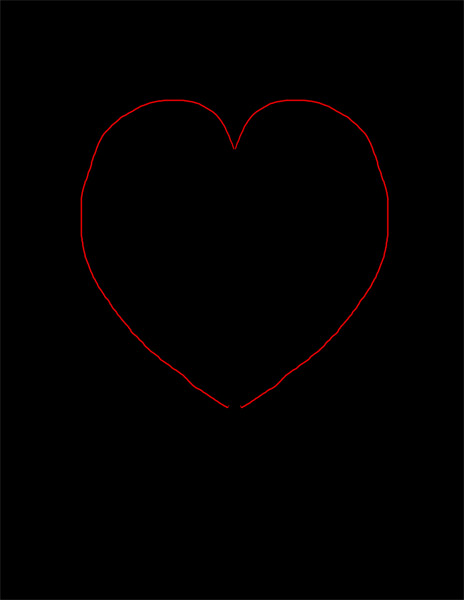
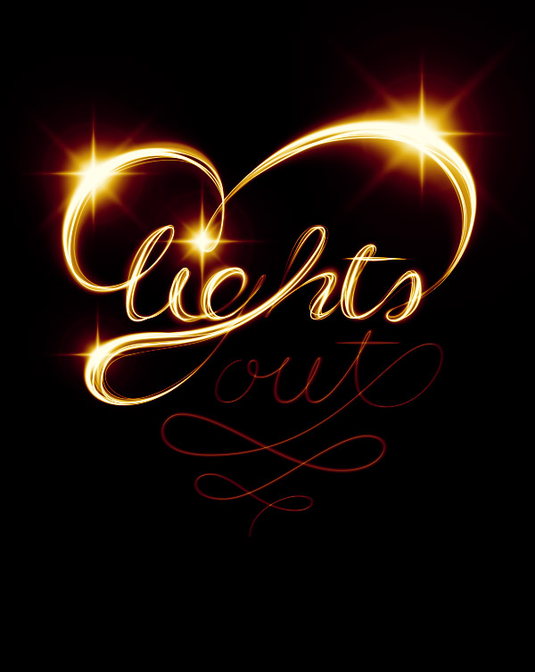
We want the overall shape to form a heart, so draw a heart really quickly.
Step 2
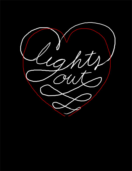
Use the guideline to draw in your text with a tablet. Consider this a sketch. If you're more comfortable doing this on paper, do it and scan it.
Step 3
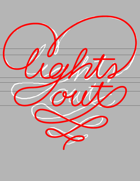
For this single step, I'm going to switch to Illustrator. I'm more comfortable with ol' Illy when it comes to lettering, but it's entirely doable in Photoshop too. Once you're done, Copy it (Command/Control-C).
2. Create the Multiple Lines
Step 1
Paste it in Photoshop as a Path (Command/Control-V, select Path in the pop-up dialog).
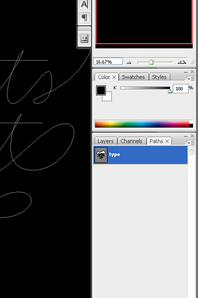
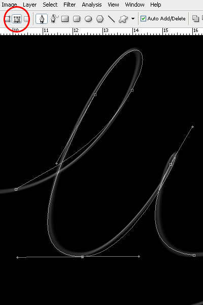
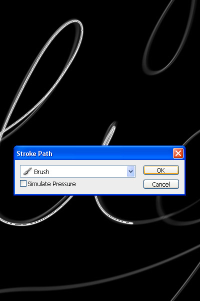
Step 2
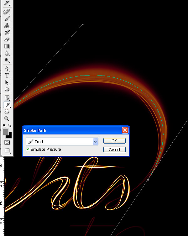
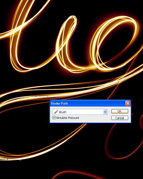
Select the Brush Tool (B) and change your brush to a 100% soft edged, 10 px diameter brush. Grab the Pen Tool (P), right-click and select Stroke Path. In the pop-up dialog, make sure Simulate Pressure is not checked and press OK.
Step 3
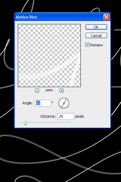
Go to Filter > Blur > Motion Blur. Change the direction to a 60 degree angle and strength to 20. Press OK.
Step 4
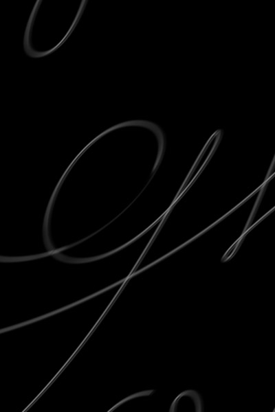
Reduce the Opacity by approx. 50% and duplicate it. Apply a Layer Mask (Layer > Layer Mask > Reveal All) and start to hide away portions with a large, black, soft brush.
Step 5
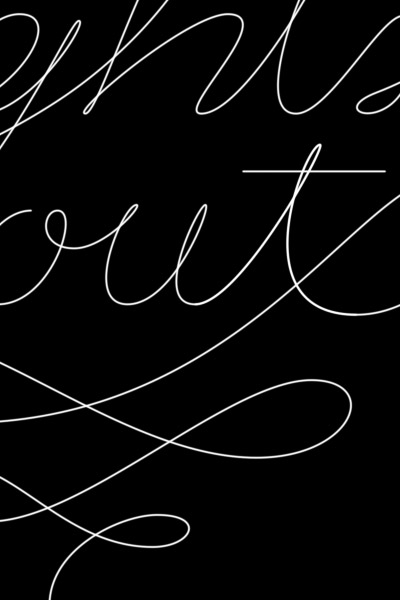
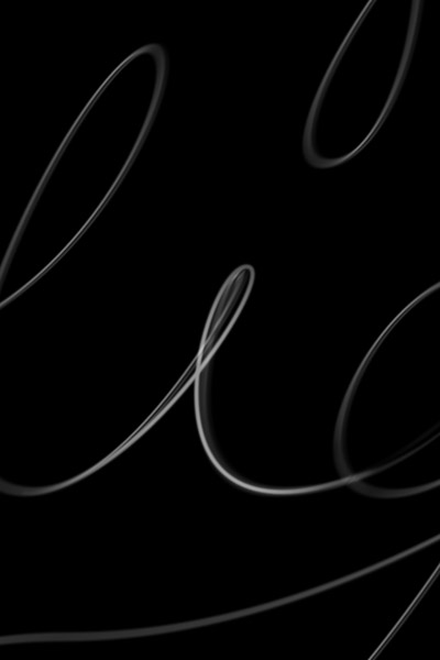
Grab the Pen Tool and trace your first light streak in Path Mode.
Step 6
Just as you did before, stroke the path with a 10 px brush. You need to do this individually in order to keep the appearance realistic. Alternate between 5, 10 and 15 px brushes and various levels of Opacity.
Step 7
After you've applied it, you need to hide both ends of the line. Use a Layer Mask and draw with black on each end.
Step 8
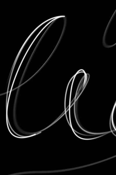
Use the original lines only as a guide. Start to add thickness to the letters, but preserve a classic typeface look by keeping the top and bottom of the bowls thin, and the sides thick.
Step 9
As you progress with the words, try to thicken the left side of each letter. Doing so will preserve the spacing between the letters.
Step 10
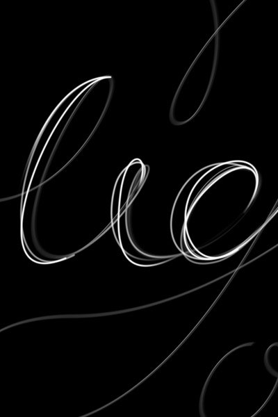
Remember to fade out each end of the lines, otherwise they won't look real.
Step 11
Work your way through the letters until you have reached a similar result.
3. Add Color
Step 1
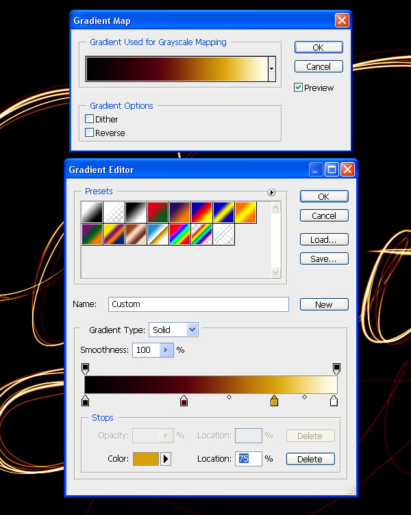
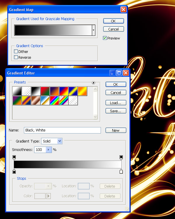
By now, it's a good idea to nail the colors of the project. Above all other layers, create a Gradient Map Adjustment Layer (Layer > New Adjustment Layer > Gradient Map) Use these colors:#000000;#54000c;#d69f0a;#fffee9.
Step 2
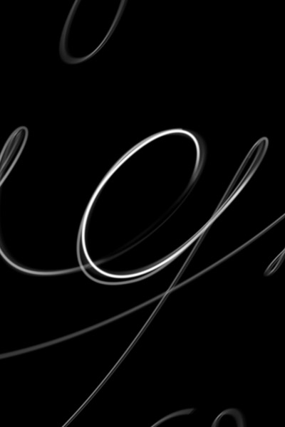
Leave the Adjustment Layer always on top. Now that we've finished the lines, it's time to add glows. Repeat the path creation process, but this time use a very large size (100–200 px) and enable Pressure Simulation. As a color, use a 50% gray (#8c8c8c). Change the Layer Style to Screen.
Step 3
Cover all the thicker portions of the letters with similar glows.
Step 4
It's time to add even thicker lines, but with Pressure Simulation enabled and white color. Use lines of varying widths (25–75 px).
Step 5
Add thicker, soft white lines all over the letters.
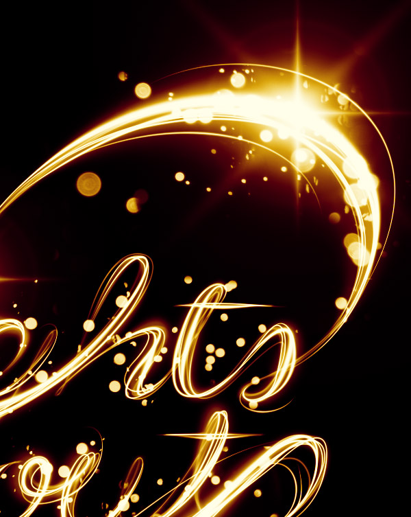
4. Add Flares to the Letters
Step 1
Download this flare image and place it in your project. Rotate it until the angles of the rays are at 90 degrees. Set the Layer Style to Screen.
Step 2
Duplicate the flare, and double its size. Rotate it by 45 degrees.
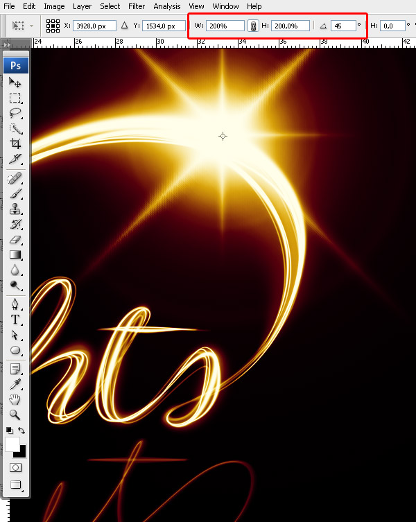
Step 3
Go to Filter > Blur > Gaussian Blur, and use approx. 30 px to soften the secondary flare.
Step 4
Duplicate this flare (both layers) and place it around the scene in points of interest.
Step 5
Repeat the previous steps to achieve the same effect for the bottom text.
Step 6
Create a few more lines around the scene that follow the original path only to a certain point. Make them white, and of different Opacity levels.
5. Add Bokeh
Step 1
Open the blurry lights image and place it in the document. Set its Layer Style to Screen.
Step 2
Apply a Layer Mask and mask out portions of the image that have lights under the crop of the image. Make sure all the lights that are left aren't sliced.
6. Enhance the Light
Step 1
In order to add a bit of contrast to the lights image, add a Black and White Gradient Map Adjustment Layer and make it a Clipping Mask for the lights image. Set its Layer Style to Overlay.
Step 2
Duplicate the lights image and apply it to different parts of the image. Use composites where you combine large dots with small.
Step 3
Apply the image to different points of interest. Try not to make it too heavy.
Step 4
We're now going to combine these lights with a custom brush to make our own. Create a new brush, and change the settings as seen below.
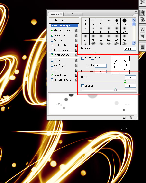
Step 5
Keep Shape Dynamics on and change the Scatter to 550.
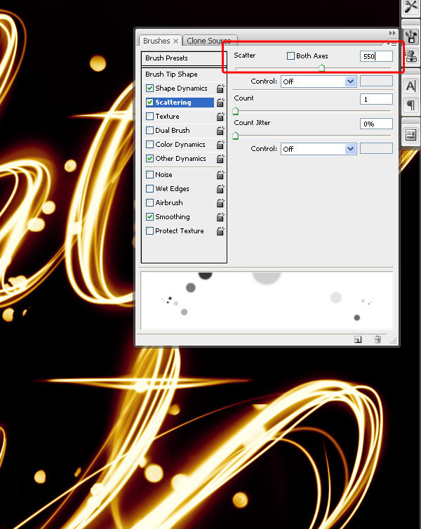
Step 6
Enable Other Dynamics and change the settings.

Step 7
Use this brush to draw much finer blurry lights along the letters.
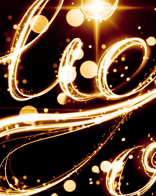
Step 8
Repeat this process.
7. Add Noise
Step 1
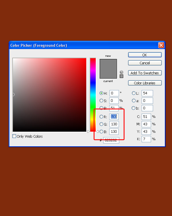
We're now going to add some noise without damaging the colors and lighting. Choose a 50% gray and fill an entire blank layer with it. It will appear brown because it is underneath the Gradient Map Layer.
Step 2
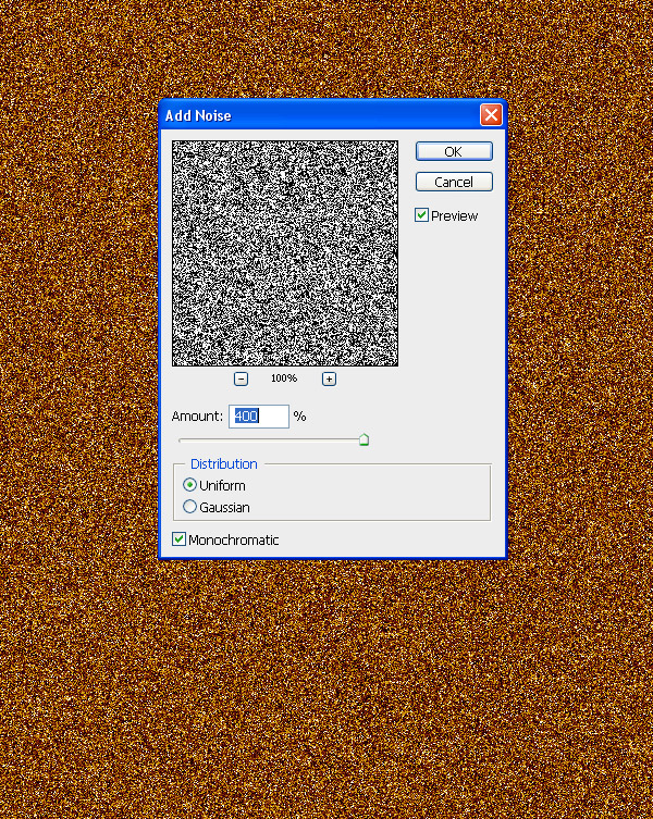
Go to Filter > Noise > Add Noise and add a max amount noise filter.
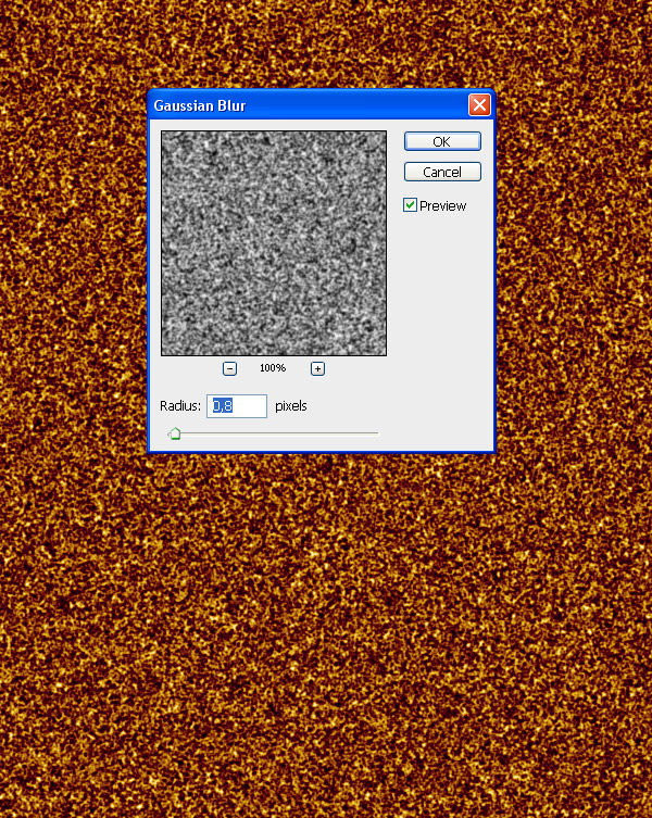
Step 3
Blur it by 0.8 px (Filter > Blur > Gaussian Blur).
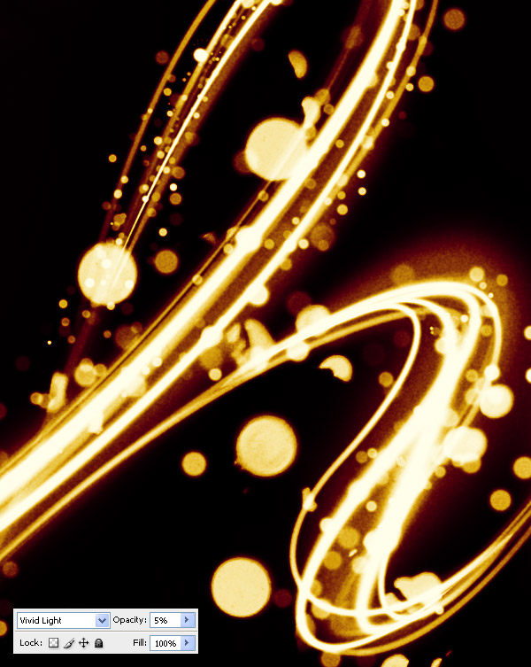
Step 4
Change the Layer Style to Vivid Light and Opacity to 5%.
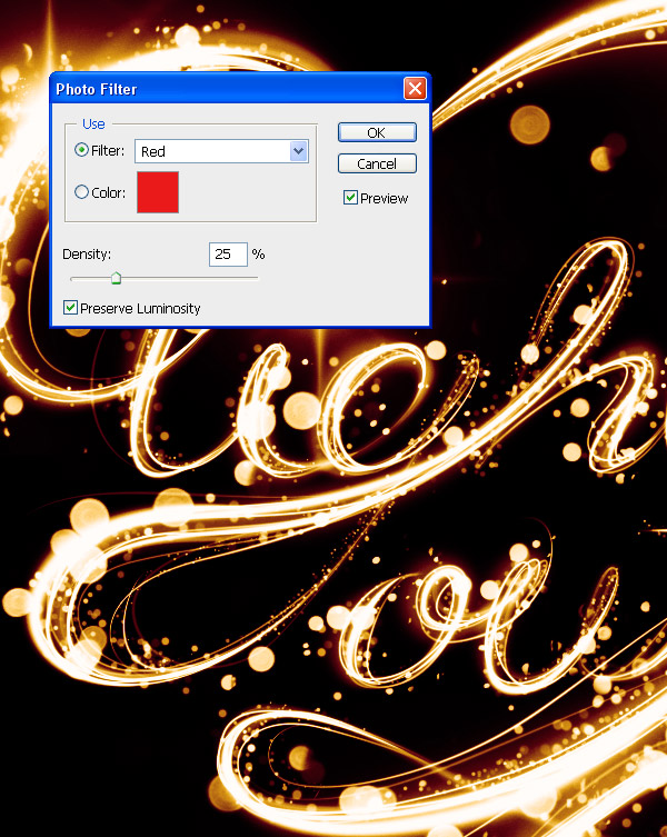
Step 5
And as one last adjustment, go to Layer > New Adjustment Layer > Photo Filter. Choose the red one.
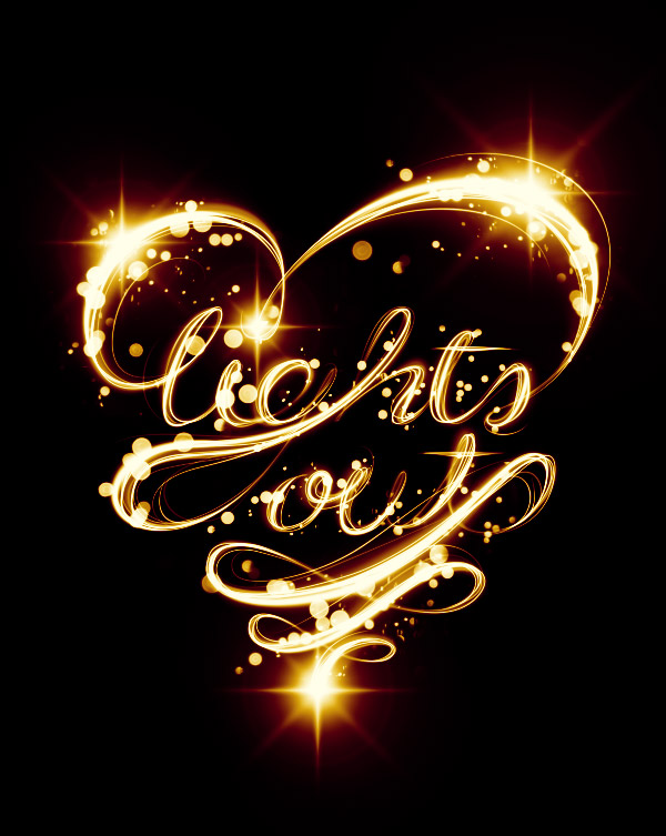
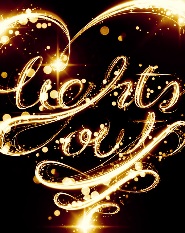
Awesome Work, You're Now Done!
Great work! Feel free to share your own end results in the comments to show others.